
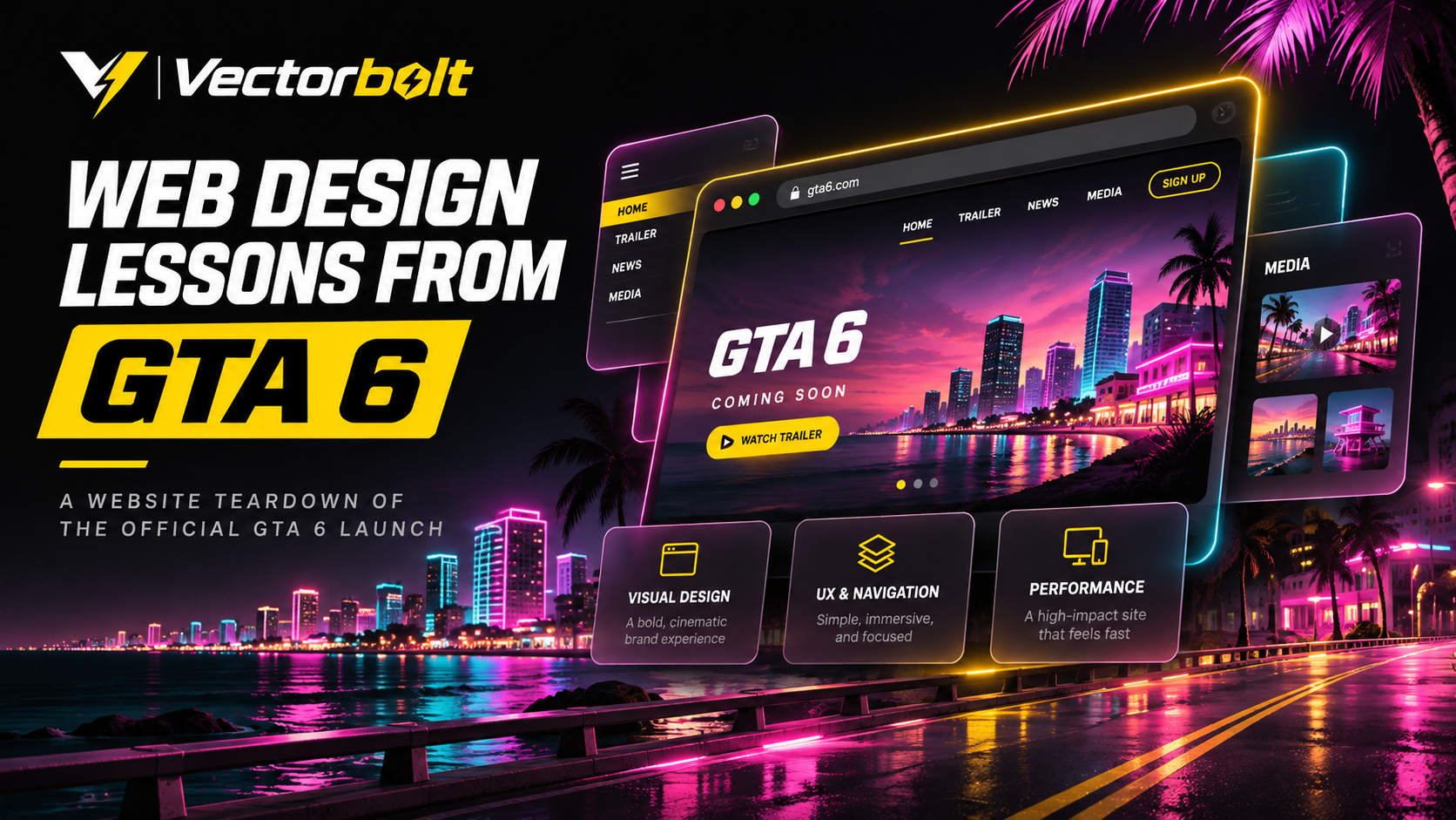
The official GTA 6 website is a launch page for a major entertainment release, not a conventional business website. Even so, its content hierarchy, media organisation and calls to action offer practical lessons for designers working on service websites, online stores and product launches.
Borrow the hierarchy
Use purposeful imagery, prominent primary actions and consistent visual language.
Avoid copying the weight
Cinematic transitions and huge assets are not appropriate for every service business.
Keep performance in view
Large media should support a specific message. Test slower connections and make the primary action accessible even if video has not loaded.
As of November 16, 2026, Rockstar’s official Grand Theft Auto VI page displays a November 19, 2026 release date, pre-order and pre-load options, PlayStation 5 and Xbox Series X|S information, trailers, editions, screenshots, story information and launch news. These are observable elements of the current site, not assumptions about its internal performance or conversion data.
1. The first screen communicates essential information
The GTA 6 launch page places the main purchase-related action near the top and communicates the release date and platforms before the deeper promotional material. Visitors do not need to search through a long page to establish what is being released or where to proceed.
Web design lesson: A strong hero section should explain the offer, provide the most important supporting facts and identify the primary action. For a service website, that may mean a descriptive service heading, a short explanation and a clearly labelled enquiry button. Decorative animation should not hide that information.
2. Visual hierarchy separates primary and secondary content
Release information and pre-order actions receive high priority. Trailers, editions, bonuses and story details follow, while screenshots, downloads, merchandise and news provide more detailed exploration. This is a deliberate content sequence that supports visitors with different levels of interest.
Web design lesson: Not every section should have the same visual weight. Decide what needs to be seen first, what reinforces the decision and what can remain secondary. Use differences in type size, spacing, contrast and placement to communicate those priorities.
3. A defined visual identity connects the full experience
Rockstar’s page connects its media presentation with the game’s setting and story. It introduces Vice City and the characters Jason and Lucia, then provides access to music, screenshots and other material. The content supports one recognisable product identity rather than a set of unrelated promotional sections.
Web design lesson: Brand consistency requires more than repeating one colour. Typography, imagery, motion, spacing and copy should support the same product or business positioning. A service company’s portfolio, contact page and homepage should feel related.
4. Media is grouped by purpose
Rockstar provides distinct routes to the launch trailer, earlier trailers, an extended look, screenshots, downloads, music and information about people and places. A visitor can select the type of content they want instead of navigating one unstructured collection of media.
Web design lesson: Group portfolio work, product demonstrations, documentation and downloadable resources by intent. For a development agency, categories such as eCommerce, WordPress and booking systems can help visitors find relevant projects faster than one undifferentiated gallery.
5. Calls to action stay consistent throughout the page
The current website repeats pre-order actions and uses more specific secondary actions, such as learning about editions or viewing media. The primary objective remains clear even as visitors scroll through different types of content.
Web design lesson: Select a clear primary conversion goal per landing page. Repeating a consistent call to action can help visitors act when they are ready. Avoid treating every button as equally important or switching between several labels for the same action.
6. The page supports both quick scanning and detailed exploration
Some visitors need only the release date, platforms and pre-order link. Others want trailers, story context, screenshots or edition details. The site’s progression gives quick answers at the top and more depth farther down.
Web design lesson: Place essential information early and make detailed material discoverable. A product page can lead with the offer and buying options, followed by specifications, comparisons, reviews and support information. A service landing page can lead with the service and CTA, followed by process, examples and FAQs.
7. The website connects launch content to ongoing updates
The official page also includes featured news, pre-load information and links to Rockstar’s wider media channels. This makes the launch site part of a broader publishing system rather than a static promotional page.
Web design lesson: Connect evergreen service pages with relevant articles, case studies, product updates and contact routes. Those relationships make content easier to discover and provide useful internal links without stuffing navigation with every page.
What businesses should copy from the GTA 6 website
- Communicate the primary offer and action within the first screen.
- Give essential facts priority over decoration.
- Keep visual identity consistent across sections and pages.
- Organise media and supporting information by user intent.
- Use a consistent primary CTA and clearly distinguished secondary links.
- Make detailed information available without making the main journey complicated.
- Connect landing pages with relevant supporting content.
What businesses should not copy
An entertainment launch page has different objectives and resources from a local service website or online store. Heavy cinematic media, complicated transitions and immersive scrolling should not be copied without a reason. A visual effect that works for a widely anticipated game can distract from a quote form or checkout.
Performance claims should also be tested rather than inferred from appearance. This review examines visible page structure and content, not Rockstar’s internal analytics, conversion rates or measured Core Web Vitals. Any business adopting a similar presentation should test mobile usability, page speed and accessibility.
How to apply these lessons to a business website
Begin by identifying the page’s primary task. Write down what a visitor needs to know before completing it. Arrange the page so the offer and primary action come first, relevant proof and supporting information come next, and optional detail remains accessible.
Review the result on mobile and desktop. Test the navigation and conversion flow, not just the visual appearance. If people cannot find the next step, the page needs restructuring before more animations are added.
Final assessment
The official GTA 6 website demonstrates how a launch page can combine a recognisable visual identity with clear product information, structured media and repeated conversion paths. The transferable value lies in those decisions, not in copying its artwork or entertainment styling.
For related guidance, read 7 Website Design Mistakes That Reduce Leads and Sales and How to Speed Up a WordPress Website. For web design and development enquiries, contact Vectorbolt.
Source: Official Grand Theft Auto VI website, Rockstar Games. Website details reviewed November 16, 2026.
THE BOTTOM LINE
Learn from the launch page’s clear priorities rather than recreating every visual effect.
